OASIS
Modern brand design that resonates with a young Muslim community
Brand & Identity,
Website
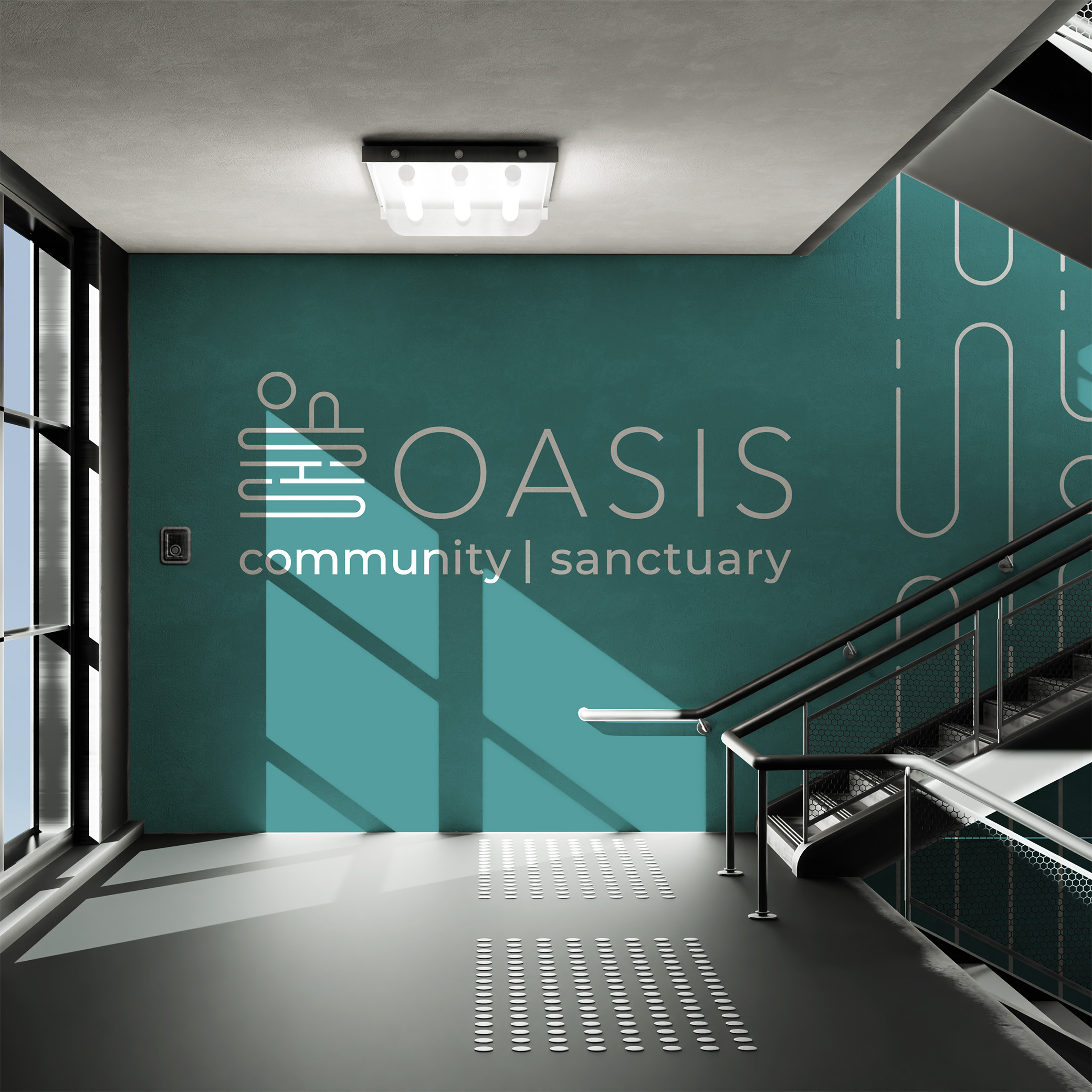
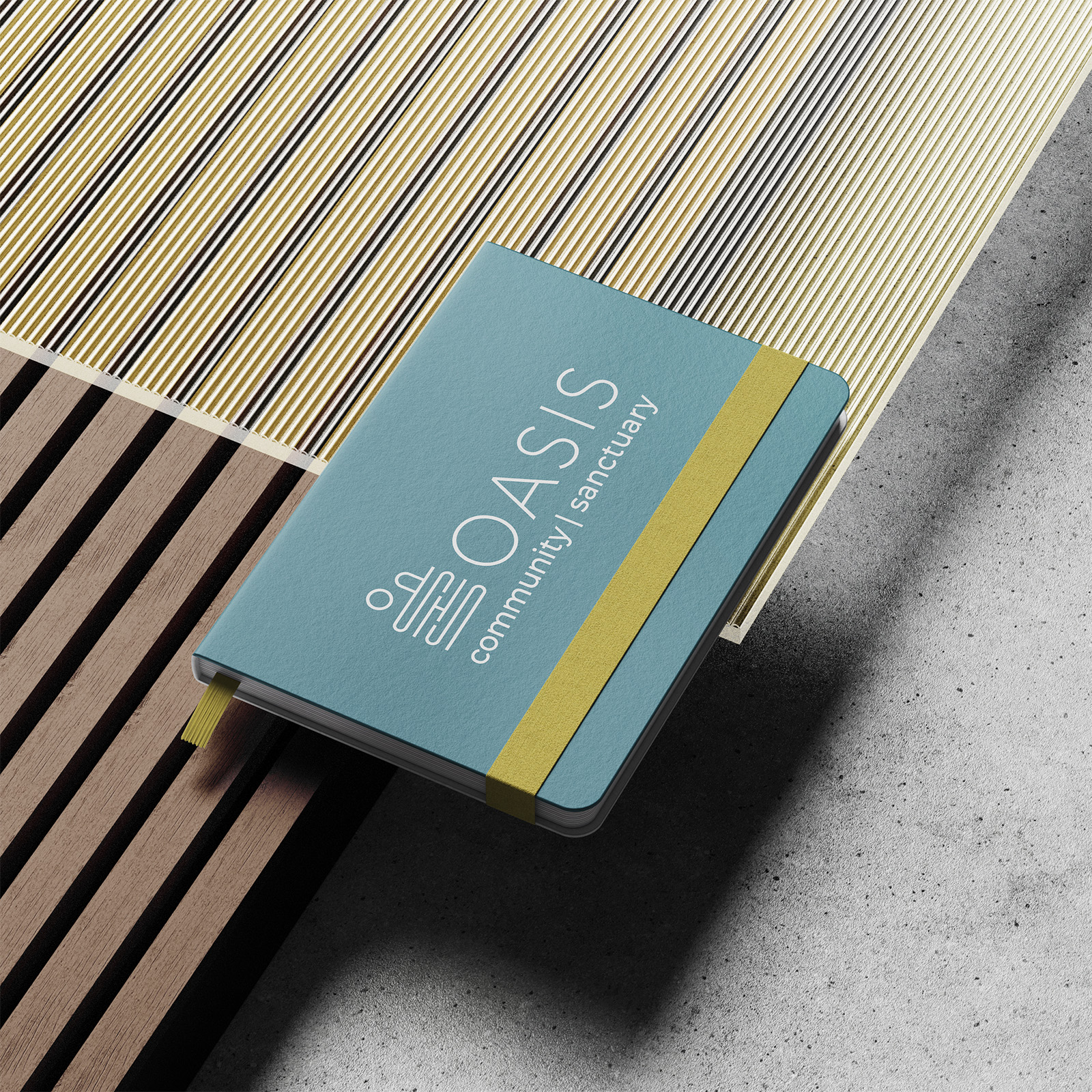
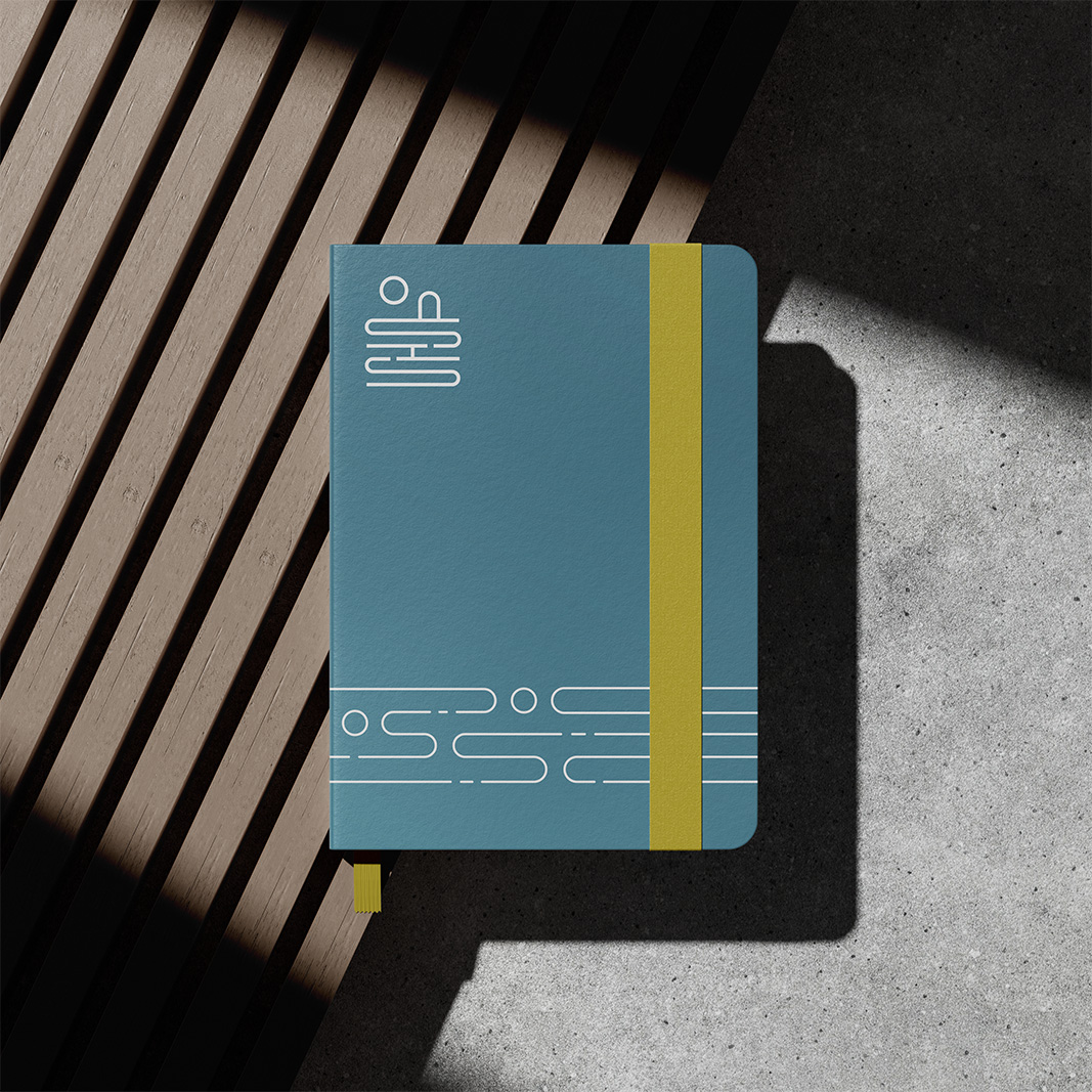
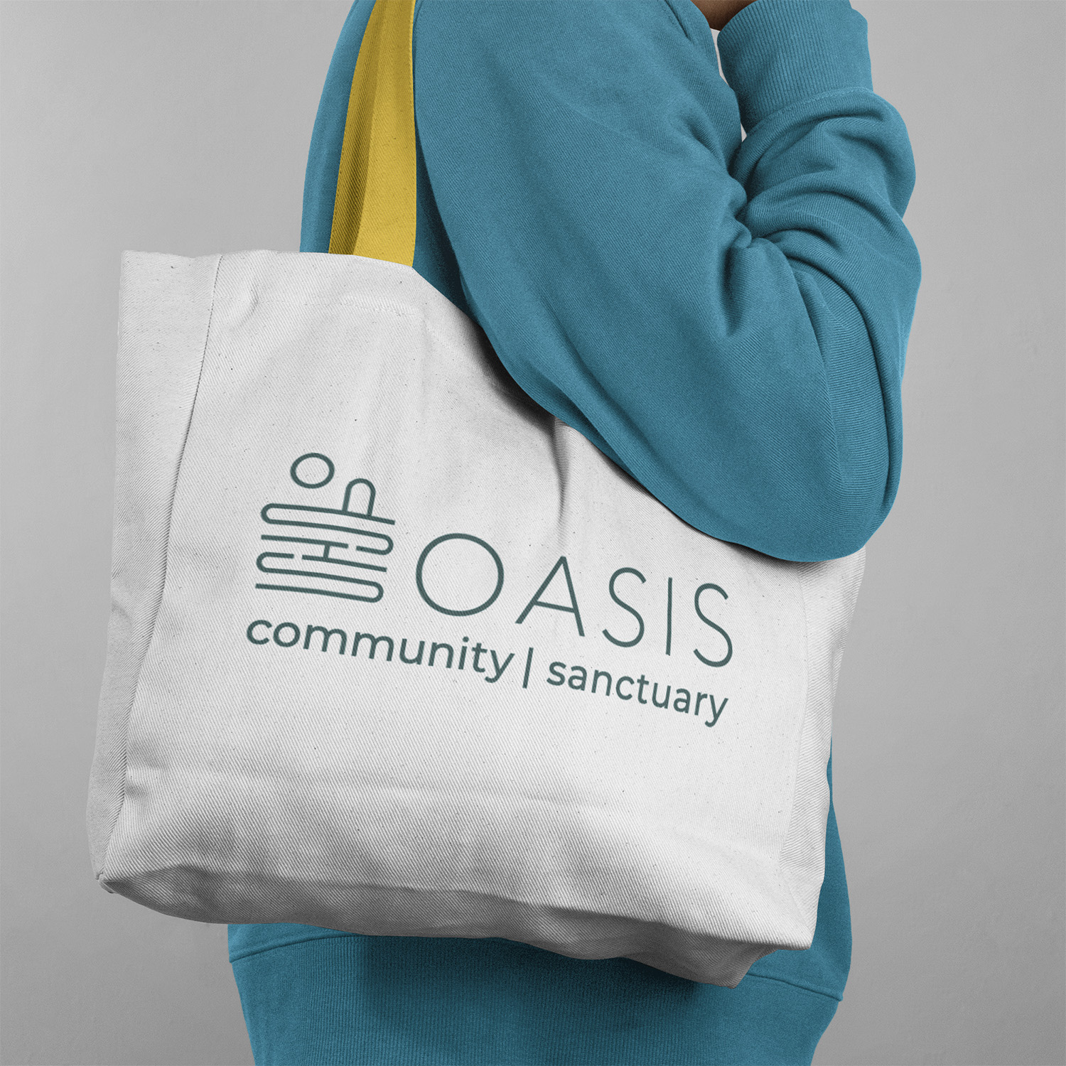
For OASIS, a Muslim youth third space and community, I delivered a brand and identity design that brought the founders' vision to life.
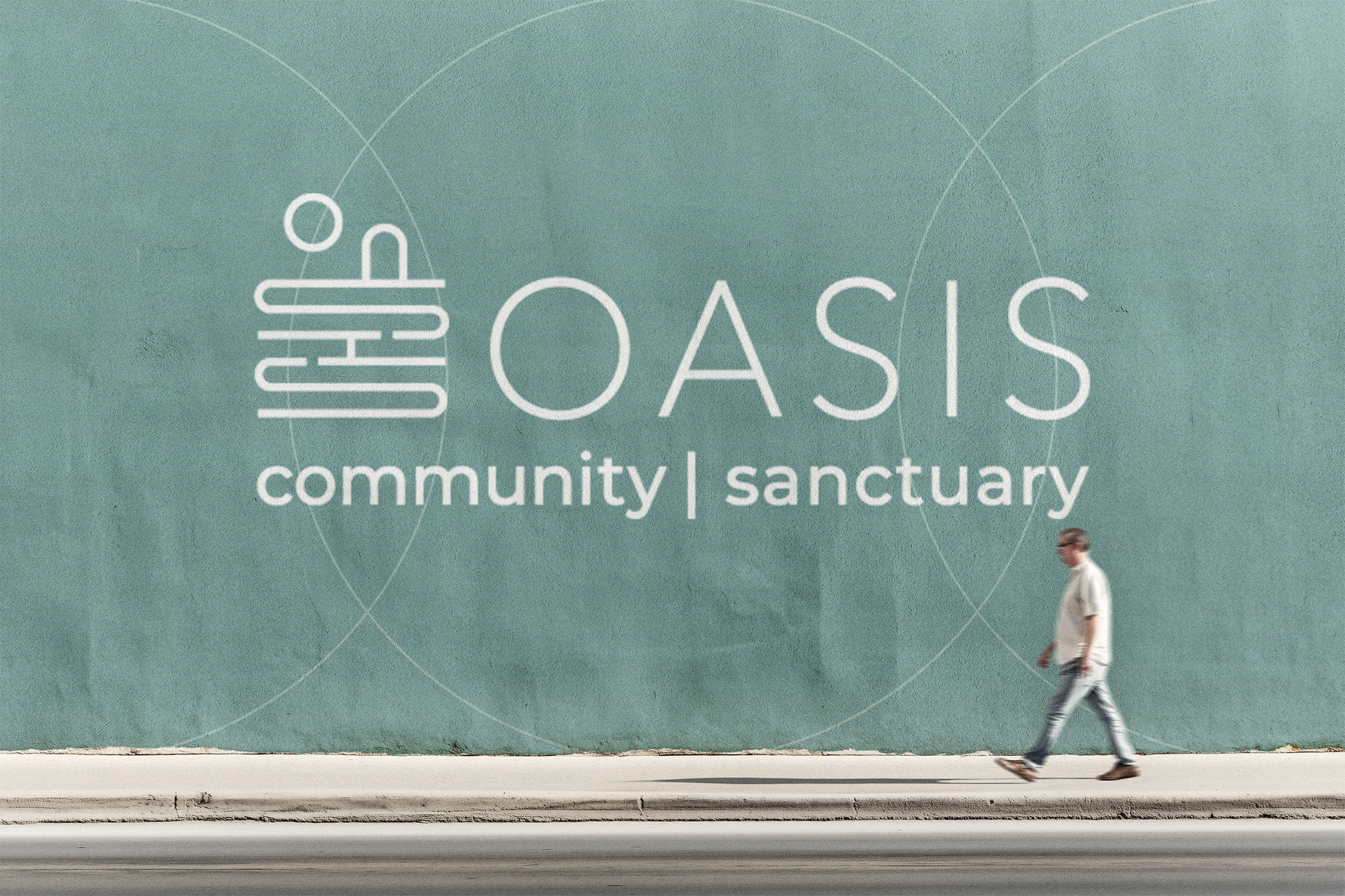
The word mark employs a slim, sleek, and contemporary typeface that conveys calmness and clarity. Its generous negative space reflects openness and possibility, mirroring the welcoming nature of the organization itself. Complementing the typography is a symbol that both spells out "oasis" and paints a visual story: a sun rising above the horizon of a body of water, with a small hill or door centered at the horizon line. This subtle yet powerful imagery evokes renewal, guidance, and the promise of safe passage—an oasis and a pathway into community.